The question of what makes something beautiful hangs heavy in the air, the anticipation of such things before an art exhibition or a fine meal for that matter. Don’t ask my opinion, lest I might give it to you. The currently available artworks from Malaysian contemporary artist, Mulaika Nordin, have come across my desk and they deserve a closer look.
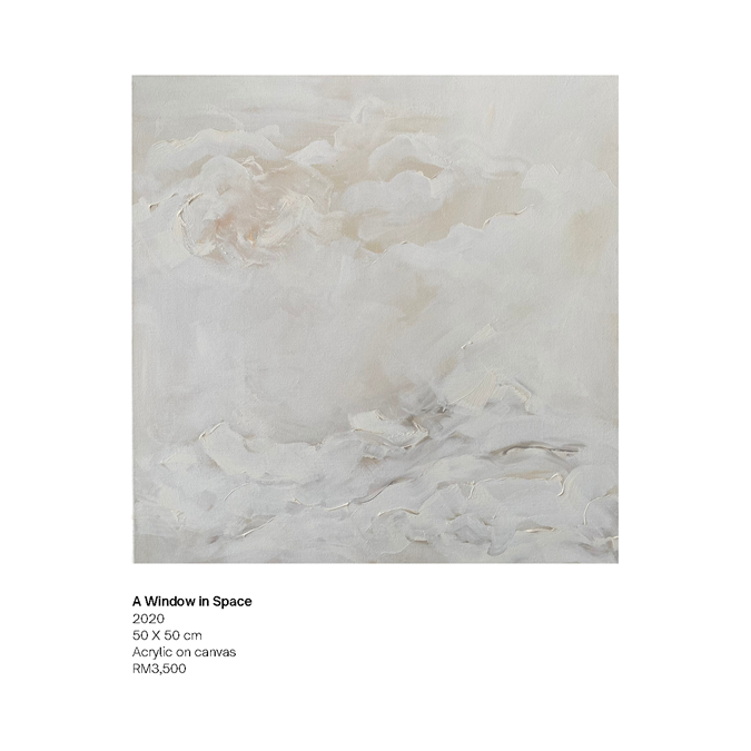
“A Window in Space” is almost a dare that the artist has made with herself. The use of dark colours has defined this current collection but for some reason, there is one piece that is white on white with elements of beige and just a hint of black. Why has the artist done this, so critics can use the word juxtaposed or is this the artist’s true north? On closer inspection, the layers of white seem to have a purpose and objective. The region on the top of the painting reminds me of a lighter shade of white while the bottom region reminds me of a lighter shade of grey, which invokes thoughts of ideals and moral questions. Which path is more virtuous, more correct, and where is the moral high ground? The title implies that from the distance in space, clear lines are blurred. Thought-provoking and aesthetically pleasing; not an easy achievement in the world that we live in.
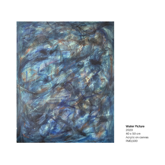
“Water Picture”. Imagine a hot summer day, the Mediterranean waters caught in a rock pool, clear enough to see to the bottom as the water moves about. But are there other elements at play, what is missing in this painting? Has the artist left this question for the viewer to decide or is there something that the artist was trying to say? The answer could lie in the corners of the frame or the one brighter than the rest of the elements in the near middle off-centre to the right. I’m undecided about this piece but that is the reason why it has to be discussed. Almost in an instant we can love or hate something. This artwork is a different discussion.
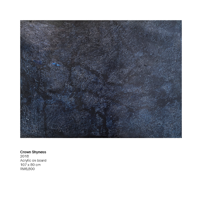
“Crown Shyness”… I understand not the name but the art speaks volumes to the galactic explorer that I imagine myself to be. There are pathways in the stars, there is magic in the small amounts of light in the vast darkness. This is the standout expression in this collection, not merely an artwork but a moment in time and space where one must hold their breath.
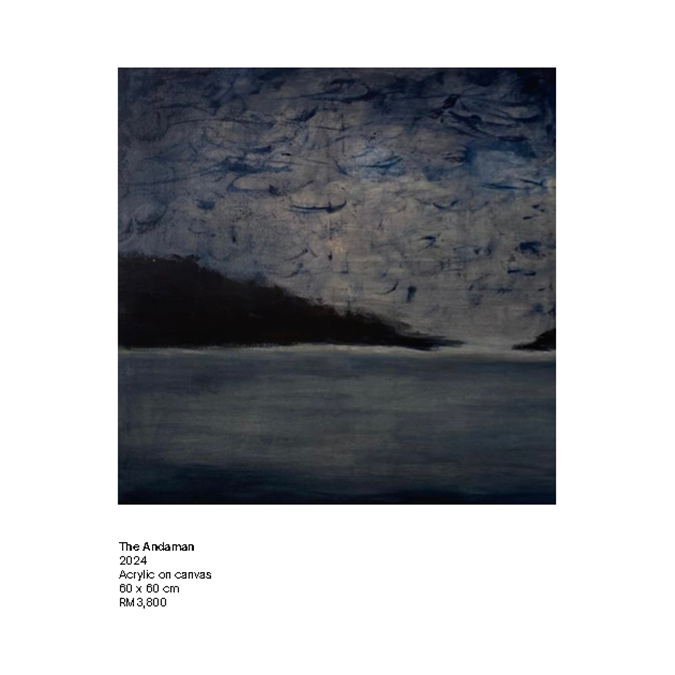
“The Andaman”. Is this a landscape or an escape? Imagine an early morning with the birds flying out before the true sunrise and a hint of a distant island presents itself as if not quite ready for the energy of the ocean and wildlife about it. This artwork would most likely change throughout the day as the different light brings more texture and context. The detail of the brush strokes of the “sky” or is it the “birds” shows that the artist saw something that morning as she woke too early or was still awake from the night before. There is still moonlight on the water that brings an element of a romantic dream to the distant waters before the heat of the Andaman Sea burns all remnants of the night before. If it were not for the existence of “Crown Shyness” in this collection then this would be my favourite.
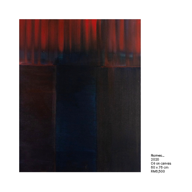
“Romeo…” wherefore art thou? Oh dear, please. This reminds me of the curtains of a dark theatre in not the West End but at some other end of London. Not that London is really a cultural capital of the world. Shakespeare, yes… Excuse me, I have digressed. The darkness of the red bleeds darker into a black foreground. Is this an attempt at bringing a sinister element to an already dark story of a tragic young lover born into the wrong family at the wrong time (we all know how that feels)? The artist has shown considerable skill and control when it comes to managing the colours that are so close on the spectrum. This is what makes this piece noteworthy. This artwork should hang in the halls of Bruce Wayne Batman types; every time you look at it subconsciously the drone of “Something in the Way” should permeate into the viewer’s frontal cortex.
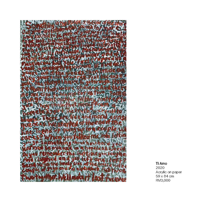
“Ti Amo” is a stand-out in style and delivery. If it was presented in an exhibition, it would either have to be the feature piece on the main wall as you first walk into the gallery forcing itself upon the crowd of gallery goers or a hidden gem in a darker corner. But on arrival, the unsuspecting find out that there is a hidden story written in plain sight for all to see. Either a daring move by the artist or a red herring to the history of the artist. My frustration will be where to hang this work (as it reminds me of a lost love so I would not want it in the lounge room reminding me of a current lover of past indiscretions). Or should it be in the den on a wall half out of sight but still in the mind’s eye?
This remains my unfeathered opinion.
*Disclaimer: The views expressed are those of the writer and do not necessarily reflect those of NHA – News Hub Asia. ![]()

